Reetu Raj
A Guide to VH, DVH, SVH, and LVH
Understanding vh, dvh, svh, and lvh can be a little tricky, but I will try to break it down. In this article, I will explain these terms, how they are different, and why they matter. Using these terms in your workflow will improve the responsiveness of your application across multiple devices.
CSS Viewport unit
Viewport units in CSS are a set of units that measure a percentage of the current viewport dimensions. They include:
- vh (viewport height): 1 vh = 1% viewport's height.
- vw (viewport width): 1 vw = 1% viewport's width.
- vmin: 1 vmin = 1% of the smaller dimension (height or width) of the viewport.
- vmax: 1 vmax = 1% of the larger dimension (height or width) of the viewport.
VH: Viewport Height
The portion of a web page that is visible to the user on screen is the viewport. It's a dynamic measurement that varies with the device used to access it. On the other hand, when elements are on mobile devices with address bars, vh units can cause layout problems. In these cases, for more control over the elements consider alternative viewport units like dhv, svh, and lvh. Later in the post, we'll go into more detail about these choices.
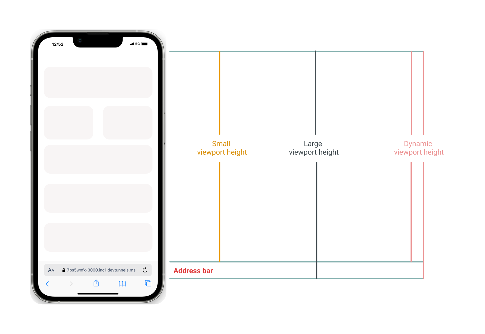
Comparison of Viewport Height Units (SVH, LVH, DVH)
DVH: Dynamic viewport height
DVH measures the height of the viewport, not the address bar on mobile devices or other dynamic elements. This ensures consistent layout adjustments regardless of the address bar appears or disappears during scrolling.
One of the drawbacks of dvh is that it might cause a significant shift in the layout when elements such as address bars appear and go. This can be really annoying for users, especially on mobile devices.
SVH: Small viewport height
SVH represents the smallest possible height the viewport can be, considering all dynamic elements. This helps maintain a consistent layout when elements like the address bar are visible.
For example, if we give a section a height of 100 svh, then it will take the smallest viewport height, not considering the address bar in mobile browsers. Just because of svh the section will be fully visible regardless of the presence or absence of the browser's address bar.
LVH: Large viewport height
LVH measures the largest possible height of the viewport, typically excluding dynamic UI elements like the address bar. This unit ensures layouts use the maximum available screen space when such elements are hidden.